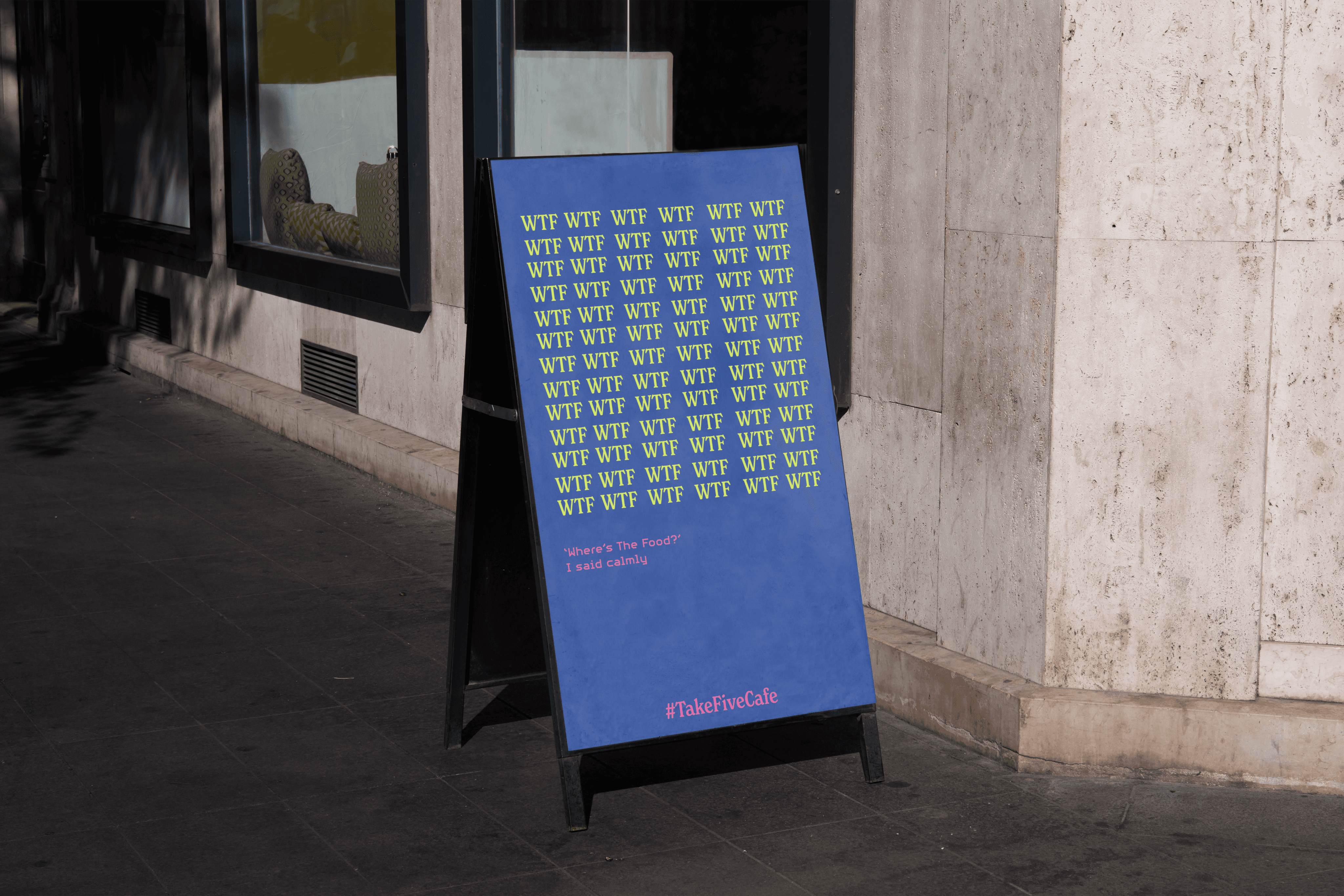
Museum of Pop’s visual identity focuses on the repetition and vibrancy of
Pop Music, as the top 10 most repetitive songs in the past few decades are
all pop genre or have pop influence.
Logo + Logo Motion
The logo has a mix of typography, to showcase the spectrum of Pop Music. With
the museum branding emphasising on repetition, the logo motion highlights that
with the ripple effect.

Typography
Similarly to the logo, the typography represents the spectrum of Pop Music, and having these
typography being different shows contrast.

Graphic Assets
The Rectangles used as the Graphic Elements were inspired by the Audio Editing Bars found in
Audio Editing Softwares.


Rollouts
With the whole idea of being repetition, it makes sense to have it as part of the language as well.

Cafe
The museum cafe features the repetitive branding.